
Luminar Brand Assets
Resources and design standards for presenting the Luminar zero-knowledge identity protocol. Use these assets to maintain brand consistency across integrations, wallets, and ecosystem platforms.
1. Brand Marks
PNG & Vector SVG FormatsPrimary Horizontal Logo
Best for standard layouts, headers, and navigation bars.

ZK Compliance Badge
Stellar Soroban identity stamp used to indicate verified ZK credentials.
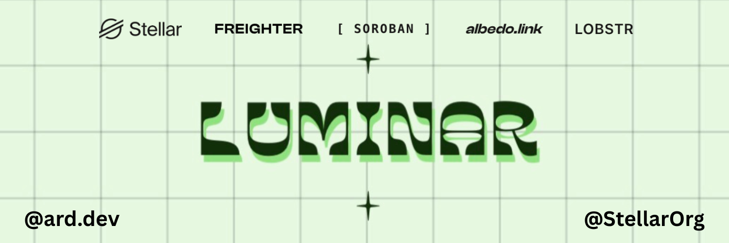
Stellar Ecosystem Partner
Partner banner for co-branding on Stellar networks and forums.

Neko.js Interactive Mascot
Easter-egg mouse chasing cat active globally across layout templates.
2. Core Color Palette
Hex & RGB ValuesLuminar Green
Primary Brand Color, Highlights, Buttons
Deep Obsidian
Primary Text, Dark Mode Backgrounds
Off-White Canvas
Main Page Background, Card Fills
Bordure Silver
Borders, Divided Lines, Subtitles
3. Typography
Font Pairings & ScaleClash Display
Used exclusively for hero titles, section headings, numbers, and primary UI callouts to emphasize bold identity characteristics.
Instrument Sans
Used for paragraph blocks, labels, form descriptions, and general text settings where readability is crucial.
4. Visual Dos & Don'ts
Guidelines for ecosystem consistency- Provide ample clear space around the logo (minimum 24px of margins).
- Ensure high contrast between the green/dark assets and the layout background.
- Prefer the horizontal logo in high-prominence headers or interfaces.
- Link directly back to
luminar.iowhen placing the compliance badge.
- Never stretch, skew, or distort the proportions of the logo.
- Do not recolor the logo elements or compliance badge outside standard brand hexes.
- Do not overlay busy background textures or complex images under text/logos.
- Avoid using the compliance stamp for non-compliance functions or general links.